The logo
The Postera logo is the core of our corporate design.
Only the logo artworks defined in this guideline should be used. Modifying the logo artworks in any way is not allowed, in order to ensure the recognizability and differentiation of the Postera brand.
Logo variations – preferred
For print as well as digital applications, it is always preferred to use either the positive logo version (Postera terra + Postera blue stone) or the negative version for use on dark backgrounds (Postera terra + white).
Logo variations –black & white print
For black and white printing, the logo artwork is depicted in all black for use on light backgrounds and all white on dark backgrounds. Do not desaturate the colored logo versions.
Picture markvariations
The picture mark color Postera terra is optimized for use on dark and light backgrounds. It is preferred to only depict the picture mark in this color.
For black and white printing, the picture mark can be used in its black version on light backgrounds and white on dark backgrounds.
Clear Space
Logo (recommended)
The recommended clear space surrounding the logo artwork is derived from the height of the picture mark.
Logo (minimum)
The minimal clear space surrounding the logo should not be smaller than the height of the Postera word mark.
Picture mark
The recommended clear space surrounding the picture mark is also derived from its height.
Logo restrictions
The minimal clear space surrounding the logo should not be smaller than the height of the Postera word mark.
Examples
- Do not rearrange logo elements
- Do not change logo colors
- Do not add typography or graphic elements
- Do not distort
- Do not rotate
- Do not reduce opacity
- Do not outline
Core colors
The core colors of Postera Capital are Postera terra, Postera blue stone and their gradations.
Postera terra is used as an accent color, which contrasts well with Postera blue stone. The rich blue tone and its gradations are used as background colors as well as for text, graphics and overlays.
Secondary colors for office applications
For office applications, where more than two colors are necessary (for example for visualizing data in graphs) additional accent colors can be used.
Generally, the use of the secondary Postera color palette defined on the right should be limited to applications, in which it is necessary.
Secondary colors in use: example graphs
Our primary colors are the preferred colors for charts, graphs, and data visualization. Secondary and tints may be added when more colors are needed. Below are some examples of charts and graphs.

A reduced usage of the secondary colors is preferred.

When working with PowerPoint, solid colors are preferred. Tints of our brand colors may be used sparingly.

Avoid placing similar colours next to each other in pie charts or bar charts.
Typography
The corporate font Proxima Nova is a clean, well
legible font which combines modern proportions
with a geometric appearance. It is used in the
medium, regular and light weights for headlines
aswell as paragraphs.
For meta information, tables and footnotes,
Proxima Nova is supplemented by the IBM Plex
mono in its regular weight in all caps.
Type styles
For headlines, Proxima Nova is used in its Medium weight. Only in the case of first level (hero) headlines, it is used in all caps.
For longer paragraphs, Postera uses the regular cut of Proxima Nova. For additional information, the light weight of Proxima Nova is used.
For “meta” information or technical notes, footnotes and numbering, the IBM Plex Mono is used in all caps and the accent color Postera terra.
Examples
Headlines are separated from the copy by a colored line in Postera Terra.
Tables
Tables are based on the main design element of Postera – the line. Lines used in tables are either white (negative) or in Postera terra.
Imagery: scene
Clean, minimalistic imagery, depicting architectural details and abstract geometric shapes creates an atmosphere of luxury surrounding the brand, without needing to be too literal or explanatory. This subtle style is used for title pages as well as backgrounds for text and graphics.

Imagery: people
For general people imagery, the protagonists are depicted in action, on the go or at work. Documentary-style images are combined with geometric, almost abstract scenes.
Posteras portraits exude confidence. The persons are looking directly at the camera, which is positioned at eye level. Backgrounds should be clean, geometric and lacking unnecessary clutter.

Touchpoint examples
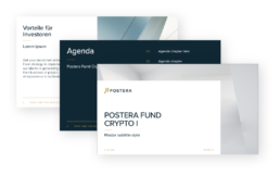
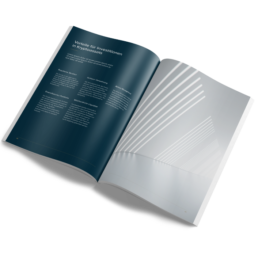
Here you find some examples of our design principles in use on different digital as well as print applications.


